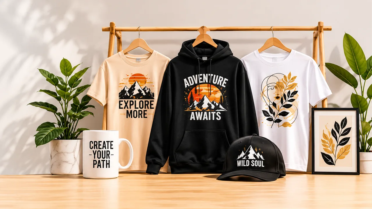
Good choices begin with useful information and a little inspiration.
Designing for print is different from designing for a screen. A phone display glows with light, while a printed shirt reflects light through ink and fabric. File settings, small details and color choices that seem unimportant on screen can make the difference between a sharp, vibrant print and a disappointing one.
Whether you design yourself or send us an idea through our free custom-order service, this checklist will help your artwork look its best on a t-shirt, hoodie, pillow or phone case.
1. Start with enough resolution
Low resolution is the most common reason for a blurry or pixelated print. A design needs enough pixels to cover the print area at the right density.
- Aim for 300 DPI at the final print size, with 150 DPI as the minimum.
- For a large front print of about 30 x 40 cm (12 x 16 inches), that means roughly 3600 x 4800 pixels at 300 DPI.
- Enlarging a small image does not add detail. Start large, or use vector artwork that scales without losing quality.
2. Use the right file format
- PNG is the best choice for most designs because it supports a transparent background.
- Keep the background transparent unless you want a visible box printed behind your design.
- Vector files such as SVG or PDF are ideal for logos and text, because they stay sharp at any size.
- Avoid JPG for designs with text or flat colors, as compression can create fuzzy edges.
3. Think about color
Screens display colors with light (RGB), while printers mix ink. Some screen colors, especially very bright neon greens, pinks and blues, cannot be reproduced exactly with ink.
- Expect printed colors to look slightly softer than on your screen.
- Check how your design looks on both light and dark garment colors.
- Avoid very fine gradients that fade into transparency, as they can print with uneven edges.
4. Watch your contrast
Contrast decides whether a design stands out or disappears.
- Dark designs need light garments, and light designs need dark garments.
- Thin, dark lines on a black hoodie are almost invisible from a distance.
- View the design at a small size on your screen. If it is hard to read as a thumbnail, it will be hard to read across a room.
5. Keep text readable
- Use a font size large enough to read from a few steps away.
- Avoid extremely thin fonts and hairline strokes, which can break up on fabric.
- Leave enough space between letters, especially in small text and outlines.
- Proofread carefully, because every item is printed exactly as designed.
6. Choose the right size and placement
Bigger is not always better. A design that fills the entire print area can look like a billboard, while a well-sized graphic looks deliberate.
- A typical adult chest print is about 25 to 30 cm (10 to 12 inches) wide.
- Left-chest logos are usually about 9 to 10 cm (3.5 to 4 inches) wide.
- Center the design horizontally and place it a few finger widths below the collar.
- On all-over products such as pillows and swim trunks, keep important elements away from edges and seams.
7. Respect copyright
Only use artwork, photos, fonts and logos that you created or have the right to use. Famous characters, brand logos and song lyrics are usually protected and cannot be printed without permission.
8. Ask for a second opinion
Before you order, step back and look at your design with fresh eyes, or show it to a friend. Is the message clear? Is it readable from a distance? Do the colors work on the chosen product?
If you would like help, our free custom-order service is designed for exactly this. Upload your file or describe your idea, and our team will check the resolution, adjust the placement and recommend the best product, so your design prints the way you imagined.